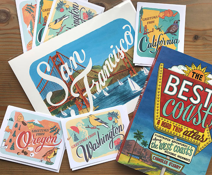
My second book, The Best Coast: A Road Trip Atlas, is out in the world and available at last! This illustrated travel guide is a celebration of the West Coast’s historic highways—perfect for both the avid traveler and the armchair explorer. Chock-full of unusual facts, hidden history, and Americana, The Best Coast is an offbeat road trip guide that tells the story of the diversity and depth that created the West Coast we know and love today—both the ever-changing present and vestiges of the past for those who slow down to look. A labor of love more than two years in the making, The Best Coast: A Road Trip Atlas contains over 400 full-color illustrations inspired by my sketchbook drawings created on my many road trips up and down the coast, as well as 99 hand-drawn maps and hundreds of hand-drawn lettering vignettes and illustrated icons.
The Best Coast: A Road Trip Atlas (Illustrated Adventures Along the West Coast’s Historic Highways) Published by Sasquatch Books ISBN 978-1-63217-174-0 Paperback, 224 pages Release date: April 9, 2019
My amazing local bookstore, King’s Books, can ship a signed copy anywhere in the world! Simply place your order online (either in the previous link or by clicking the King’s logo above), and in the “order comments” box mention that you want a signed copy, and whether or not you want the book personalized to a specific name.
Looking to buy a signed copy directly from me?
I will also be stocking and selling signed copies of the book, but because I don’t really have the infrastructure to store huge quantities of books and ship them all over the place, I’ve made the decision to only sell books myself to local customers (either at local events or direct from my studio when folks can pick up their copy in person), and leave the long-distance orders to King’s Books. This has worked really well with my previous book, and it helps support both King’s and my own business! You can find a list of my upcoming events here, or if you’d like to contact me to arrange pick-up, you can find my contact info here.
Thank you for all your support, and happy reading!
In exactly one week, The Best Coast will be here! To celebrate the book’s publication, we’ll be holding the big launch party at my amazing local bookstore, King’s Books. I’ll be giving brief remarks about the process behind the book, showing some of my original paintings, and of course, signing books! We’ll also have a drawing for prizes, including signed books, art prints and other goodies. Here’s the skinny:
Best Coast launch party
Wednesday, April 10, 2019 7 pm, free! King’s Books 218 St. Helens Ave, Tacoma, WA More info about the event here
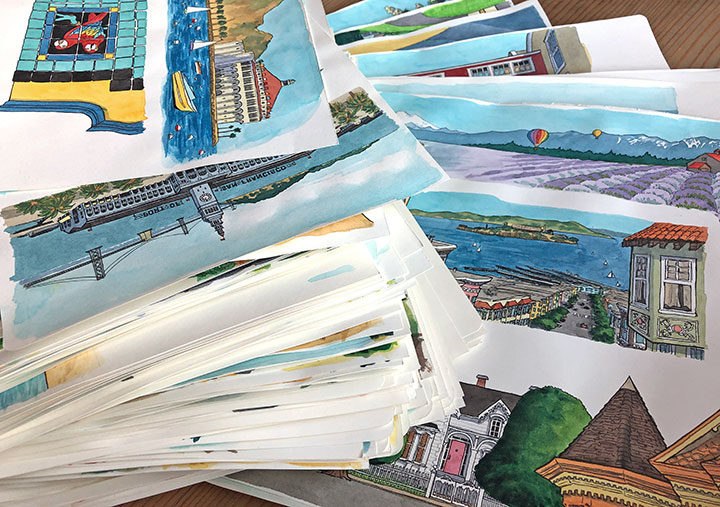
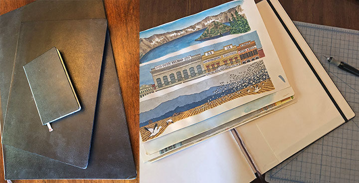
In the meantime (or if you’re not local), check out the latest Miss Adventure podcast, where Mary and I talk about the process behind The Best Coast. We get into some of the nitty-gritty details of creating the book, including some of crazy stats behind this thing: like the fact that there are over 400 full-color illustrations in the book, 99 hand-drawn maps, over 100 hand-lettered type treatments, and well over 100 illustrated icons. (That pile of illustrations above, cut out of giant Moleskine books, is more than six inches thick!)
Coming up later this week, I’ll be featured on the We Art Tacoma podcast as well, where I chat about the book with host Erik Hanberg, along with musings on ten+ years of being a working artist in Tacoma, and how the arts community here has grown and changed over the years.
And one last thing: there’s also just one week left to get in on our Instagram photo contest, where you can win a signed copy of the book! You can read all about it on my IG post here; you have until 11:59 pm on Tuesday, April 9 to post your photos.
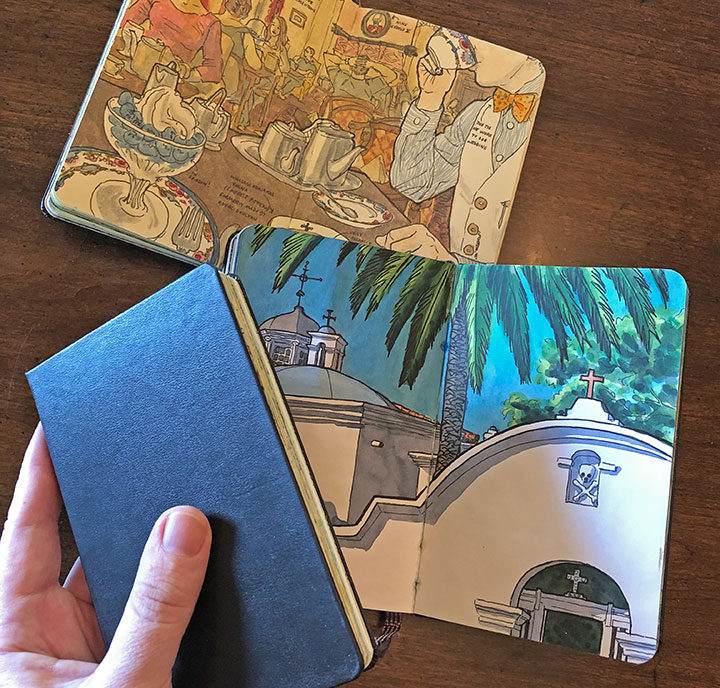
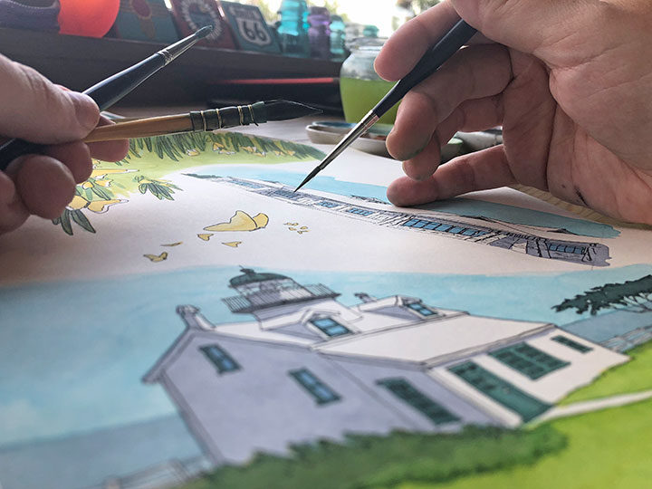
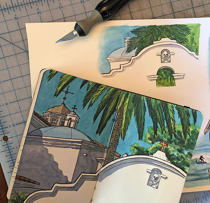
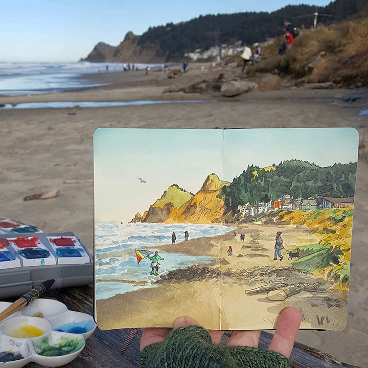
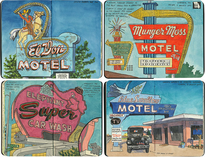
When I was putting together my book proposal for The Best Coast (and later when I started the process of building the book itself), I imagined its illustrations to be an extension of my sketchbook drawings. After all, I’ve spent so many years documenting my travels in my sketchbooks that they’ve become an integral part of how I think, how I see the world.
But while the sketchbook is an ideal medium for capturing images out in the field…
…it didn’t lend itself very well to the finished illustrations that appear in the book. For one thing, I had to design each page spread around the text of the book; the amount and proportion of real estate allotted for each illustration was entirely dependent on the text content and length. For another, my travel sketches usually span an entire page spread in the sketchbook; things like gutters (the center fold) and book stitching would be distracting if they were reproduced in The Best Coast. And besides, the sketchbooks I use are pocket-sized—not exactly ideal for large, full-spread book illustrations.
Still, I wanted to preserve the overall look and feel of my sketchbook drawings in my book illustrations. Not only was that style of drawing what I was largely known for as an artist, but I also just loved the quality of the line work and watercolor in those little sketchbooks, and wanted to reproduce it as closely as I could. The sketchbooks I most often use are the Moleskine brand—the paper inside is actually terrible for watercolor (not a material I’d recommend for beginning watercolorists!), something akin to painting on a manila folder. But I’d been working with that paper for so many years that I knew how to wrangle it, and I also knew that if I chose some other paper for my book illustrations, I’d have to master a different learning curve to achieve results I was happy with.
Luckily, I did a little research, and discovered that Moleskine makes the exact same sketchbooks I use in much larger sizes! So I bought a bunch of them and carefully cut the pages out of the binding.
And just like that, I had the exact same paper I was used to working with, on a much larger scale (and without those page gutters to worry about). I could just spread out in my studio and get to work without any interruption.
Some of the illustrations in my book are straightforward re-workings of my sketchbook drawings, while others are new and completely different. But it felt so good to work with the same materials that I take out with me into the field—that made it easy to transport myself back to the time and place where I got to capture each location in person. As a result, The Best Coast is every bit of an extension of myself as my sketchbooks are.
Over the years, I’ve amassed zillions of travel photos and created tons of sketchbook drawings, which then served as inspiration for the illustrations in my new book, The Best Coast. And now, Sasquatch Books and I want to see your Best Coast photos! Post your best, most hilarious, or most awkward West Coast road trip photos on Instagram, and the best three will win prizes!
Here’s how it works: post your photos to Instagram using the hashtags #bestcoastchandler and #contest AND tagging@sasquatchbooks. The photos have to be yours (either ones you shot yourself, or your vintage family photos, NOT rando photos you found on the internet!), and they have to depict somewhere on the West Coast (WA/OR/CA), but beyond that, it’s up to you.
Maybe it’s a picture of little-kid you with your grandpa in front of a Paul Bunyan statue. Maybe it’s a photo from an old family road trip when your mom made everyone in your family wear matching fanny packs. Maybe it shows a historic landmark you visited long ago, that’s no longer standing today. Or maybe it’s just a lovely photo you took at a national park, or your favorite beach photo, etc.
You can post your pictures through April 9, the publication date for The Best Coast; after that I’ll choose the three best photos, and on April 12 I’ll contact the winners via DM to get your shipping address (contest open to winners with US addresses only, sorry!). I’ll also repost the three winning photos to my Instagram account and blog once the winners confirm their addresses.
The prizes: The Grand Prize winner will receive a signed copy of The Best Coast plus a bundle of my art goodies (a 9 x 12 West Coast travel print and a box set of 6 assorted West Coaststate cards). Two runner-up winners will each receive a signed copy of the book. Prizes will be mailed via USPS in April, as soon as the winners confirm their addresses.
The fine print: NO PURCHASE NECESSARY. Enter between March 18, 2019 and April 9, 2019. Open to US residents, 18 and older. Void where prohibited or restricted by law. See official rules for full details. Contest sponsored by Sasquatch Books.
Best of luck! I can’t wait to see what y’all come up with.
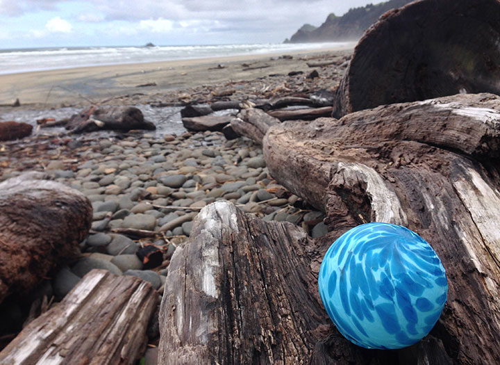
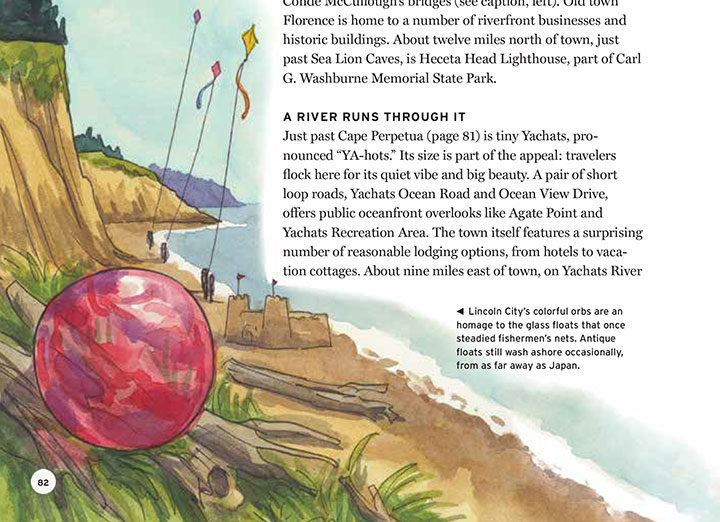
One of the things I wanted to include in my book is Finders Keepers, a community art event and public treasure hunt in Lincoln City, Oregon. Every year for the last two decades, local artists have created hundreds of hand-blown glass floats and hidden them for beachcombers to find and take home—the name says it all: you find it, you keep it. The glass orbs are reminiscent of the old Japanese fishing floats that once drifted the Pacific regularly and washed ashore in the thousands (and are now an extremely rare catch)—beach “trash” of incredible beauty.
Finders Keepers was once limited to the offseason, to try to draw winter tourists to the region. It’s grown so popular (and even inspired knock-off projects like Tacoma’s own Monkeyshines tradition) that they’ve recently extended it to a year-round event. But that doesn’t mean that the floats are easy to find. I got absurdly lucky once—above is my treasure from a solo trip a few years ago—but with seven miles of shoreline within the town limits, searching for glass really is like looking for the proverbial needle in a haystack.
Last year some San Francisco friends invited the Tailor and me to meet them for a long winter weekend in Lincoln City, so we could all comb the beach together. No dice, as it turned out, but the best part is that the treasure is always secondary to the hunt itself.
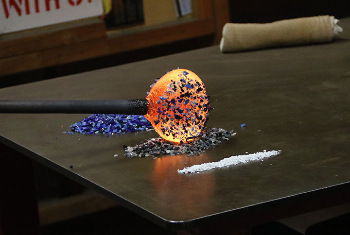
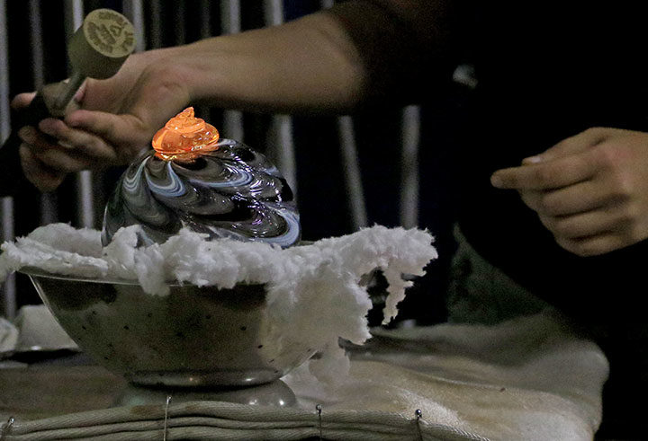
Our friends, though, had a brilliant idea: if we couldn’t find glass floats on the beach, why not make a few of our own?
I had never blown glass before, but since I live in a glassblowing capital, I’d always wanted to try it.
And I have to say, it’s every bit as mesmerizing to do as it is to watch. There’s something so satisfying about playing with molten glass, and trying to guess how the finished product will turn out.
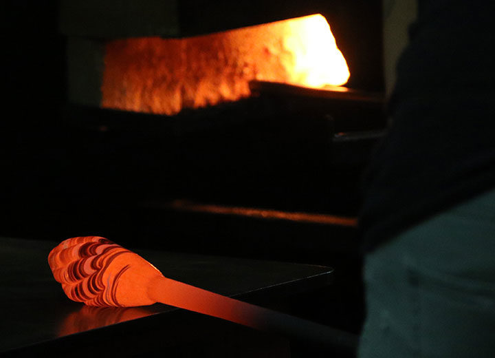
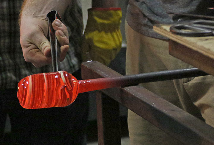
We each topped off our floats with a medallion stamped with the place and year, and left them in the studio’s kiln overnight to complete the annealing (slow-cooling) process. (That part is crucial—years of searching for Monkeyshines in Tacoma has taught me that if glass isn’t annealed properly, the piece can explode into a zillion shards, even weeks later!)
The next morning we picked up our finished products, and left Lincoln City with the perfect travel souvenirs and friendship mementos.
As a bonus, I left with plenty of first-hand knowledge to use as book fodder, as well as a head (and sketchbook, and camera) full of imagery to inspire the illustration.
Since today is #WorldBookDay, I thought I’d share a behind-the-scenes look at the process behind the cover design of my new book. And just like any part of bringing a book to life, creating the cover is a careful, detailed, and often lengthy process.
Designing a book cover is more of a science than an art—because the design has to be extremely hard-working, every part of the design has to be well thought out and carefully considered. Since it has to be eye-catching in every setting (at thumbnail size in a catalog, on a bookstore shelf amongst a slew of other titles, etc.) everything from subject matter to typography/legibility to color scheme is important. That’s a lot of responsibility to place on one image!
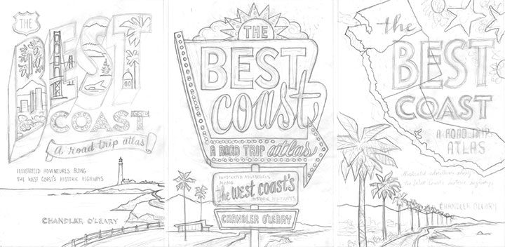
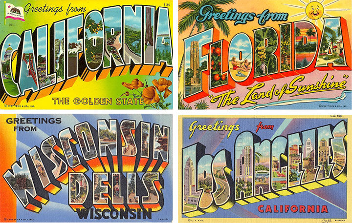
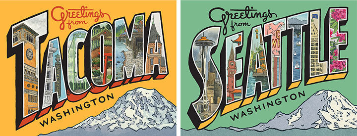
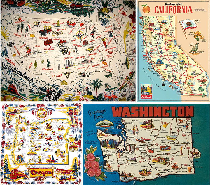
Thankfully, I had a lot of vintage inspiration to…well, draw from, as a starting point. Because the book encompasses many vintage roadside attractions and other historic icons, it made sense to reference vintage travel ephemera, at least in one of the three sketch concepts I developed for the editorial and design team at Sasquatch.
For the first concept (the one on the left in the above trio of sketches), I used vintage travel postcards as a starting point. We’ve all seen these things—they were absolutely ubiquitous for decades, and it’s easy to see why they’re so iconic.
I’ve even referenced them in my own work in the past—these are some greeting cards I created recently, combining original lettering with a mish-mash of some of my older sketchbook drawings.
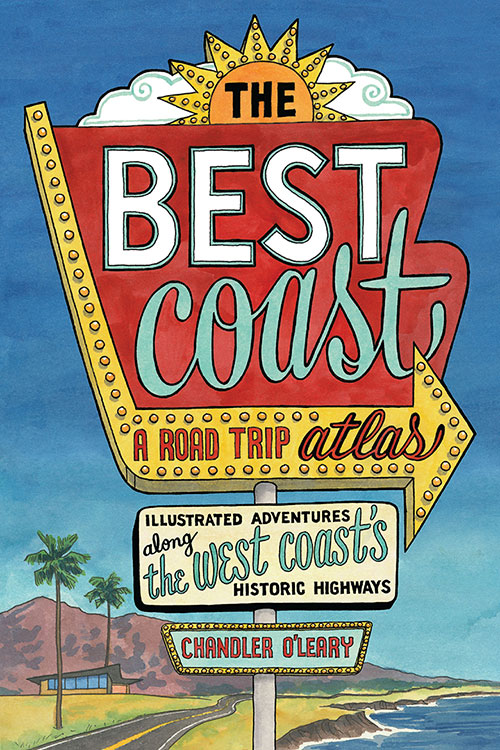
For the second cover concept, I created a faux neon sign, based on the many, many examples I’ve seen and sketched on my road trips over the years. Thankfully, so many of these old signs are still around today that their unique “Googie” design style is still instantly recognizable to viewers of all ages.
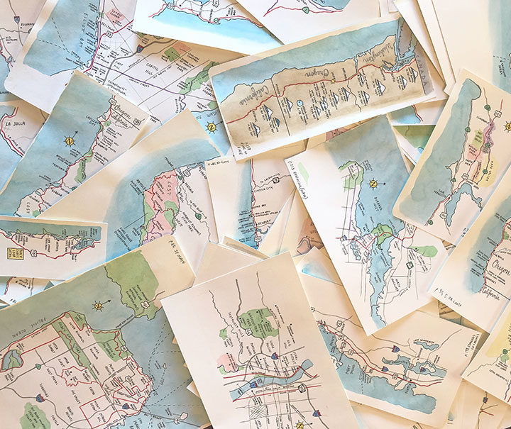
And finally, I wanted to create a cover concept that at least gave a passing nod to another staple of vintage travel ephemera: the souvenir map. I have a major soft spot for these things (as well as a big personal collection of map postcards and even midcentury map tablecloths—as anyone who has ever attended Studio Tour will have seen!), and have referenced them over and over again in my work. And after all, this book is an atlas—there are nearly a hundred maps inside, so it made sense to at least try one on the cover. In the end, I kept the map part of my third cover sketch super simple, but the thought process behind it was still there.
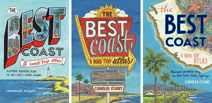
Here are the three full-color cover concepts I sent to Sasquatch. And the winner was chosen pretty unanimously—everyone was drawn to the neon sign concept (including me!). The weird thing, though, was that unlike the cover process for Dead Feminists, this book cover went from zero to finished in record time. I was bracing myself for an endless number of revisions, color tweaks and do-overs, because that’s what it took last time to arrive at the right cover. So imagine my surprise when the Sasquatch team got back to me and said that they’d shown it to everyone from design to marketing to sales, and they’d all agreed that we’d pretty much hit it out of the park on the first try!
So that was it—I made a few tiny tweaks to the lettering of the subhead, and a few subtle color changes, and Bob’s your uncle. With Dead Feminists, we were still revising the cover right up until the book went to press. This time it was the other way around: the cover was done months ahead of time, and the book itself was being tweaked and edited until the last possible second. But that’s another story for another day…
While I’ve hinted at this several times on social media, and even shown some snippets of my process along the way, mostly I’ve been sitting on my hands lately, trying my best to keep mum while I wait for time to tick by. And now the waiting is almost over, and it’s time for the big reveal of my new book!
At long last, The Best Coast: A Road Trip Atlasis almost here! This book—an entirely illustrated travel guide to the West Coast—has been a labor of love for me, spanning more than two years of work on the book itself and a solid decade of research, road trips and travel sketching. And now we’re just a little over a month away from the publication date on April 9!
I’ll be sharing a lot more here and over at Drawn the Road Again (after today, different content in each place) in the days and weeks to come: behind-the-scenes process images, stories and sketches behind the locations featured in the book, a social media photo contest (with prizes!), and much more. And if you’re local, we’ll be throwing the official launch party right here in Tacoma:
Best Coast launch party Wednesday, April 10, 2019 7 pm, free! King’s Books 218 St. Helens Ave, Tacoma, WA
P.S. Because people always ask me, yes, preordering—as opposed to waiting until the book comes out—makes a huge difference. Books with strong preorder sales get better promotion from both the publisher and retailers, get a better ranking on huge sites like Amazon (and thus better exposure), and reach a wider audience of both customers and press outlets. So every preorder counts, and is like an extra boost of support, both for me and for your favorite retailer.
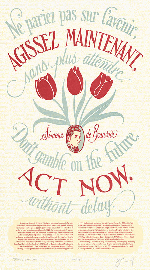
This year we have been following current events with increasing dismay—lately it seems like women are embattled on every front. At the heart of every struggle are women telling their stories, testifying en masse to uncover and combat abuse, inequality, and the erosion of our civil rights. What is shocking is just how many women coming forward it takes for our testimonies to be taken seriously. Women have learned time and time again that we must band together, seeking justice in numbers. So for our newest Dead Feminists broadside, we turned to Simone de Beauvoir, who shepherded hundreds of women together to speak up for the rights of all:
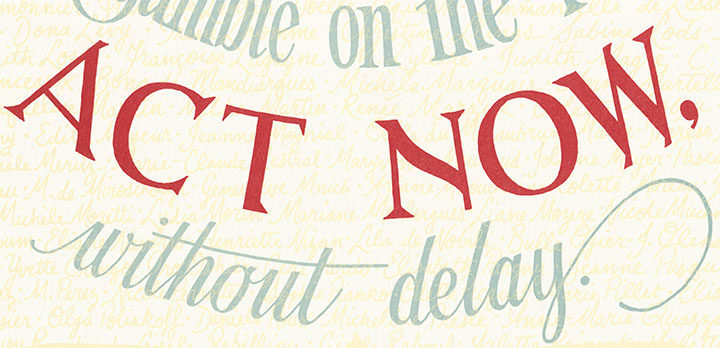
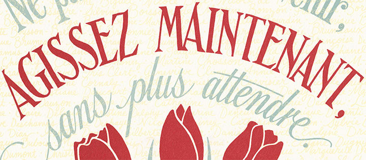
Ne pariez pas sur l’avenir, agissez maintenant, sans plus attendre. (Don’t gamble on the future, act now, without delay.)
Simone de Beauvoir was a complex, controversial, even problematic figure all her life. Hesitant to call herself a philosopher, she nevertheless was an influential member of the French existentialist movement. Her many essays and books examined the very idea of self, particularly that of women in light of society’s expectations and constraints. She contended that women are as capable of choice as men, and that when women take responsibility for themselves and the world, they can choose their own freedom. Her tumultuous personal life, which made her as infamous as her writings, embodied this staunch belief in freedom of choice. Unwilling ever to marry or even set up a joint household with anyone, de Beauvoir maintained a 51-year partnership with Jean-Paul Sartre as well as numerous affairs with both men and women. Her insistence on intrapersonal, educational and economic independence flew in the face of what she called society’s “othering” of women through stereotypes and the myth of the feminine mystique.
In the 1970s, de Beauvoir finally “came out” publicly as a feminist, and used her platform to advocate for reproductive rights for French women. In 1971 she wrote a manifesto calling for the legalization of abortion, and published it in a prominent magazine. She knew that simply calling for change wouldn’t be enough to tip the scales—nor would simply sharing her own story in the process. So she gathered together hundreds of other women who were willing to come forward and testify that they, too, had undergone illegal abortions. These women signed the Manifeste des 343, in full knowledge that they might risk persecution (or even prosecution) for speaking up. American women soon followed, when 53 others — including Billie Jean King, Gloria Steinem and Judy Collins—told their own abortion stories in Ms. magazine. Today there are projects like Lindy West’s Shout Your Abortion, where contemporary women of all ages speak the hard truths that society is often unwilling to hear. Beyond their personal choices, what these women have in common is the knowledge that it takes reaching critical mass before societal change will come.
This has all happened before in other public spheres, and unfortunately, it will all happen again. And that’s because almost all of us know on an instinctual level that as far as society is concerned, one woman’s testimony is garbage. When we come forward to report assault or abuse, we are at best patronized or disbelieved—at worst vilified, doxxed, threatened, sued, attacked, even murdered. When we remain silent, we are criticized for not reporting, for not protecting future victims. There is no winning this terrible game, so we seek safety—and credibility—in numbers. In 1991 a group of 1600 Black women took out a full-page ad in the New York Times, lending their names and support for Anita Hill as she testified against then-Supreme Court nominee Clarence Thomas. This year 1600 men did the same for Dr. Christine Blasey Ford, as she gave sworn testimony against Brett Kavanaugh. Both Thomas and Kavanaugh were confirmed to lifetime Court appointments—Dr. Blasey Ford is still living in hiding to protect her family from the constant threats she receives. As of November 2018, 499 gymnasts have come forward to accuse sports doctor Larry Nassar of sexual abuse—it took more than 20 years of reporting to the authorities by at least 100 of these victims (several of them pictured above) before the case finally went to trial. Sixty accusers and one male comedian speaking out were required to bring Bill Cosby to justice. At least as many women have come forward to accuse Harvey Weinstein; it is yet to be determined whether he’ll stand trial for the allegations against him. (Even Simone de Beauvoir found herself on the other side of the witness stand, when several of her former female students came forward and accused her of seducing them while they were still minors.) And when it comes to legislation for women’s rights, it takes much more than a village—it takes all of us speaking with one voice.
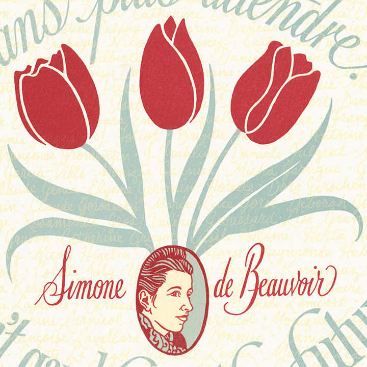
In light of these and countless other stories, our 28th broadside, Liberté, Egalité, Sororité, is layered with meaning. To symbolize the sheer number of women it takes to speak out before our testimonies are taken seriously, every name from the Manifeste des 343 shines through Simone de Beauvoir’s translucent quote. These names are cut off by the edges of the paper, signifying the disbelief and contempt women face when they come forward. In the center of the design is a trio of red tulips, as a nod to Margaret Atwood’s book The Handmaid’s Tale, which teems with floral metaphors of femininity, fertility, death and control.
To help fight the erosion of reproductive rights and protect Roe, we are donating a portion of our proceeds to Center for Reproductive Rights, via an Action Grant from the Dead Feminists Fund. The Center for Reproductive Rights uses the power of law to advance reproductive rights as fundamental human rights around the world.
Liberté, Egalité, Sororité: No. 28 in the Dead Feminists series Edition size: 173 Poster size: 10 x 18 inches
Printed from hand-drawn lettering and illustrations on an antique Vandercook Universal One press, on archival, 100% rag (cotton) paper. Each piece is numbered and signed by both artists.
Colophon reads: Simone de Beauvoir (1908 – 1986) was born to a bourgeois Parisian family who lost their fortune just after World War I. With upward mobility via marriage no longer an option, de Beauvoir focused on her education in order to earn an independent living. In 1928 she became the ninth woman to earn a degree from the Sorbonne, completing a thesis in philosophy. After an early teaching career (which ended once her relationships with underage female students came to light), de Beauvoir devoted her time to writing. Her numerous affairs with other writers also influenced her (and their) work, most notably her 51-year partnership with fellow existentialist Jean-Paul Sartre. In her landmark 1949 book Le Deuxième Sexe (The Second Sex), she declared, “One is not born but becomes a woman,” defining arbitrary societal gender constructs as the source of women’s oppression.
In 1971 de Beauvoir wrote and signed the Manifeste des 343, published in the French weekly magazine Le Nouvel Observateur. This petition of prominent women who underwent illegal abortions called for free access to contraception and the legalization of abortion. Despite attacks by the media—who dubbed the signers 343 salopes (sluts)—the document inspired 331 American doctors to publish a similar manifesto ahead of the 1973 Roe v. Wade Supreme Court decision. In 1975 France followed suit with the passage of the “Veil Law” which legalized abortion.
Illustrated by Chandler O’Leary and printed by Jessica Spring, honoring the brave women who come forward despite personal threats, testifying to secure and protect the rights of all. 173 copies were printed by hand at Springtide Press in Tacoma.
Special thanks to our friends Rebecca Wilkin and Gilles Brocard for their French translation assistance!
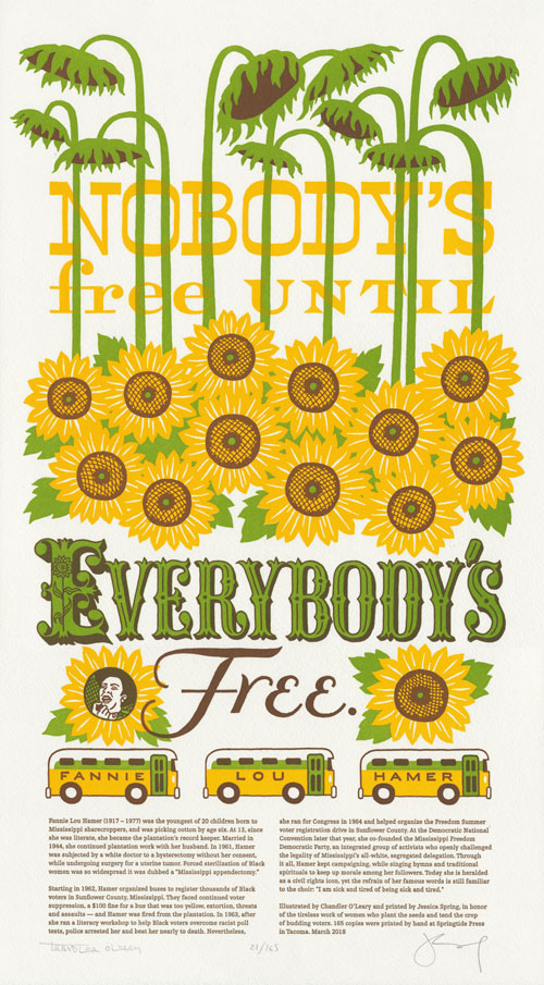
Midterm elections are looming, and we have a lot of work ahead of us. We knew right away that with this being an election year, we wanted to feature voting rights activist Fannie Lou Hamer for our next Dead Feminists broadside. But before long we realized that Hamer could carry us down the rabbit hole, with seemingly endless social issues to investigate through the lens of her life and work. Which should be the focus for our broadside? Where would we even start? We could have chosen any number of things, just based on Hamer’s story. Her Congressional bid evoked the contemporary groundswell of women newly running for office. Her forced sterilization in 1961 brought up reproductive rights and the Pro-Choice movement’s shadow history of racist eugenics. Her survival of a beating in a county jail underscored this country’s persistent police brutality against Black citizens. Her work with community agriculture reminded us of America’s continued lack of food security and equal access to nutrition for the working poor. And taken together, all of these myriad issues and problems are distilled and rarefied by Hamer’s simple truism:
Nobody’s free until everybody’s free.
It was that simplicity that swayed us in the end: Hamer started with focusing on the vote, and so did we. As the midterms approach, it is increasingly obvious to us that turning out the vote is the only way to turn the rising tide of state-sanctioned inequality and violence. It is more important than ever to help continue Hamer’s work, to combat racism and make sure that all Americans have the same access to their constitutionally-protected rights of suffrage. That task is as difficult as it’s been in decades, thanks to the Supreme Court overturning key portions of the Voting Rights Act in 2013. And Black voters—those voters who most reliably stand for progressive causes and candidates, and who are already disproportionally targeted for disenfranchisement—are feeling the effects of that ruling. If progressives want their help in November, we need to help them first.
Fannie Lou Townsend was one of 20 children born to a family of sharecroppers in Mississippi; by the time she was a teenager, she was picking up to 300 pounds of Mississippi Delta cotton per day, despite a permanent leg injury from having polio as a child. Though she was only able to attend school through age 12, she loved learning and was an avid reader—years of Bible study forged for her a personal connection between scriptural stories of liberation and the modern Civil Rights movement. In 1945 she married Perry “Pap” Hamer, a fellow sharecropper, and the couple later adopted two daughters. In 1962 she attended her first mass meeting—it was there that she learned for the first time, at the age of 44, that Black people had the right to vote. A few days later she and sixteen others boarded a bus to Indianola, MS to register as voters (her attempt was unsuccessful, thanks to literacy tests and poll taxes)—and the following day, she was fired from her plantation job. Pap was fired shortly afterward.
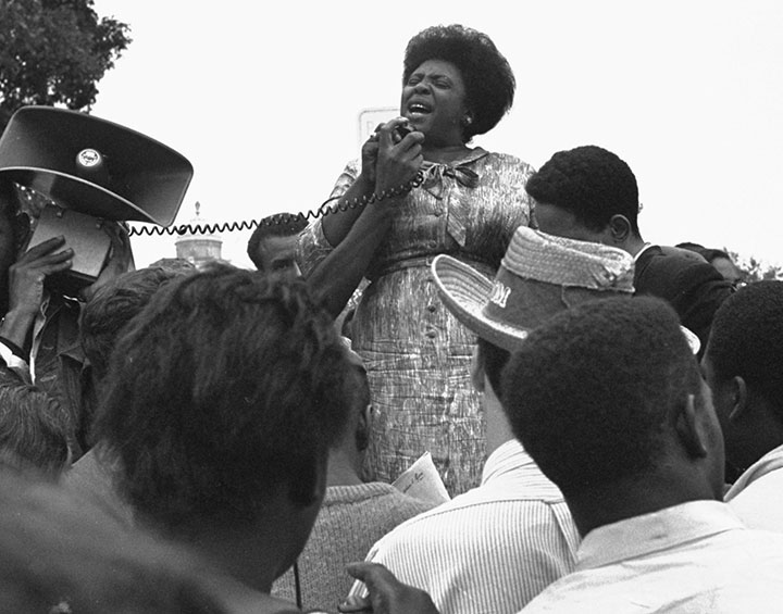
Hamer continued to try to register to vote, and started helping others attempt to overcome the racist literacy tests, poll taxes and transportation challenges that stood in the way. As her interest in direct action for civil rights increased, so did the attempts to silence her. Days after she lost her plantation job, she survived a drive-by shooting attempt by white supremacists. In 1963, while on a bus trip with fellow activisits from the Southern Christian Leadership Conference, Hamer and several others were arrested after being refused service at a cafe in Winona, MS. After being taken to the county jail, a state trooper took Hamer into a cell and ordered two inmates to beat her with blackjacks while the police held her down and groped her. The state trooper then joined in on the near-fatal beating, leaving Hamer with permanent damage to her legs, eyes and kidneys. She kept up her activism anyway: “I guess if I’d had any sense, I’d have been a little scared — but what was the point of being scared? The only thing they could do was kill me, and it kinda seemed like they’d been trying to do that a little bit at a time since I could remember.”
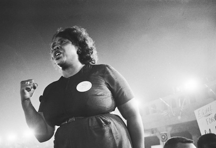
After the police beating, Hamer traveled widely on a public speaking tour—sharing her story, singing gospel hymns, gaining followers and raising money for civil rights groups. In 1964, after co-founding the Mississippi Freedom Democratic Party (which helped expand Black voter registration and challenged the state’s all-white hold on the party), she ran for Congress. Her bid against a white incumbent was unsuccessful, but in an interview with The Nation she said, “I’m showing the people that a Negro can run for office.”
The Mississippi Freedom Democratic Party continued to grow, agitating for change to the system of seating only white Mississippi Democrats at the Democratic National Convention. Hamer and her fellow MFDP members traveled to the 1964 Convention to stand as the state’s official delegates, with Hamer was chosen as the party’s speaker—prompting the white delegates to walk out in protest. President Lyndon Johnson—who generally supported the Civil Rights movement and signed the Voting Rights Act into law in 1965—feared he’d lose his bid for reelection without the support of white Southern Democrats. To appease them and bolster his own campaign, he preempted the broadcast of Hamer’s convention speech by holding a nationally-televised press conference at the same time. Finally, in 1968 the national Democratic Party changed its rules to require equal representation from its states’ delegates, and the MFDP was seated at that year’s National Convention alongside the white Southern Democrats. In 1972, the same year that Shirley Chisholm ran for President, Hamer was elected as a national party delegate.
Hamer’s voice continued to inspire her national following, even as she narrowed her focus back to her native Sunflower County, Mississippi. In the late 1960s she lent her time, money and energy to a number of grassroots efforts there, including a communal farm and livestock share program to increase food security and nutrition equality among the sharecroppers and rural Black residents. She argued that self-sufficiency was the best path to full citizenship for Black Mississippians, and promoted land ownership and crop control as essential civil rights. She enlisted the help of a Wisconsin nonprofit called Measure for Measure, and secured a large celebrity donation from Harry Belafonte, to found the Freedom Farm Corporation and begin buying up Mississippi Delta farmland. By 1971, despite threats by white supremacists, Hamer had acquired over 600 acres for use in communal agriculture: “If we have that land, can’t anybody starve us out.”
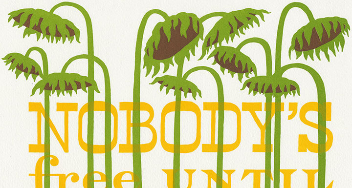
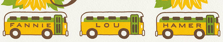
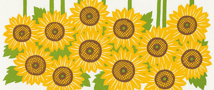
Our 27th broadside, Seeding the Vote, honors Sunflower County, where Hamer planted so many seeds for freedom, suffrage and full citizenship for all. The first half of the quote sits “behind bars,” obscured by the stalks of wilted sunflowers, while the second half is festooned with vibrant yellow blossoms. Hamer’s portrait hovers above a trio of her iconic yellow voter registration buses—which are also designed to be reminiscent of other Civil Rights Movement buses in the American South, including Rosa Parks’ famous bus in Montgomery, Alabama.
To help combat the same racist disenfranchisement that Fannie devoted her life to fighting, we are donating, via a grant from the Dead Feminists Fund, a portion of our proceeds to Spread the Vote, a nonprofit that obtains government-issued photo IDs to help eligible voters meet the requirements of voter ID laws. Currently 34 states have some form of voter ID law as a requirement for enfranchisement; many of the strictest laws exist in states with a large percentage of Black or other minority voters. With their IDs obtained with the help of Spread the Vote, these same people can also secure housing, jobs and other essentials more easily—helping them participate more fully in society and exercise their rights as Americans.
Seeding the Vote: No. 27 in the Dead Feminists series Edition size: 165 Poster size: 10 x 18 inches
Printed on an antique Vandercook Universal One press, on archival, 100% rag (cotton) paper. Each piece is numbered and signed by both artists.
Colophon reads:
Fannie Lou Hamer (1917 – 1977) was the youngest of 20 children born to Mississippi sharecroppers, and was picking cotton by age six. At 13, since she was literate, she became the plantation’s record keeper. Married in 1944, she continued plantation work with her husband. In 1961, Hamer was subjected by a white doctor to a hysterectomy without her consent, while undergoing surgery for a uterine tumor. Forced sterilization of Black women was so widespread it was dubbed a “Mississippi appendectomy.”
Starting in 1962, Hamer organized buses to register thousands of Black voters in Sunflower County, Mississippi. They faced continued voter suppression, a $100 fine for a bus that was too yellow, extortion, threats and assaults — and Hamer was fired from the plantation. In 1963, after she ran a literacy workshop to help Black voters overcome racist poll tests, police arrested her and beat her nearly to death. Nevertheless, she ran for Congress in 1964 and helped organize the Freedom Summer voter registration drive in Sunflower County. At the Democratic National Convention later that year, she co-founded the Mississippi Freedom Democratic Party, an integrated group of activists who openly challenged the legality of Mississippi’s all-white, segregated delegation. Through it all, Hamer kept campaigning, while signing hyms and traditional spirituals to keep up morale among her followers. Today she is heralded as a civil rights icon, yet the refrain of her famous words is still familiar to the choir: “I am sick and tired of being sick and tired.”
Illustrated by Chandler O’Leary and printed by Jessica Spring, in honor of the tireless work of women who plant the seeds and tend the crop of budding voters.
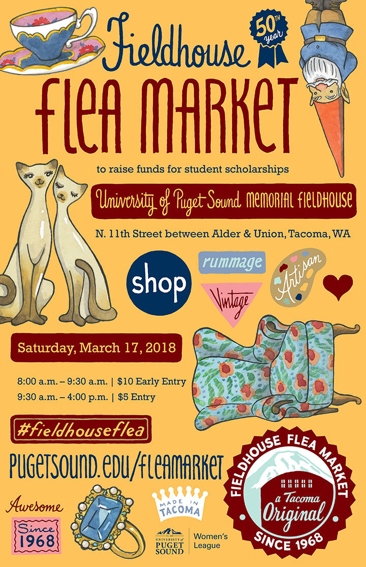
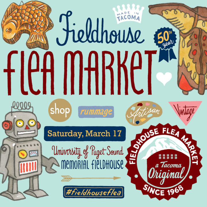
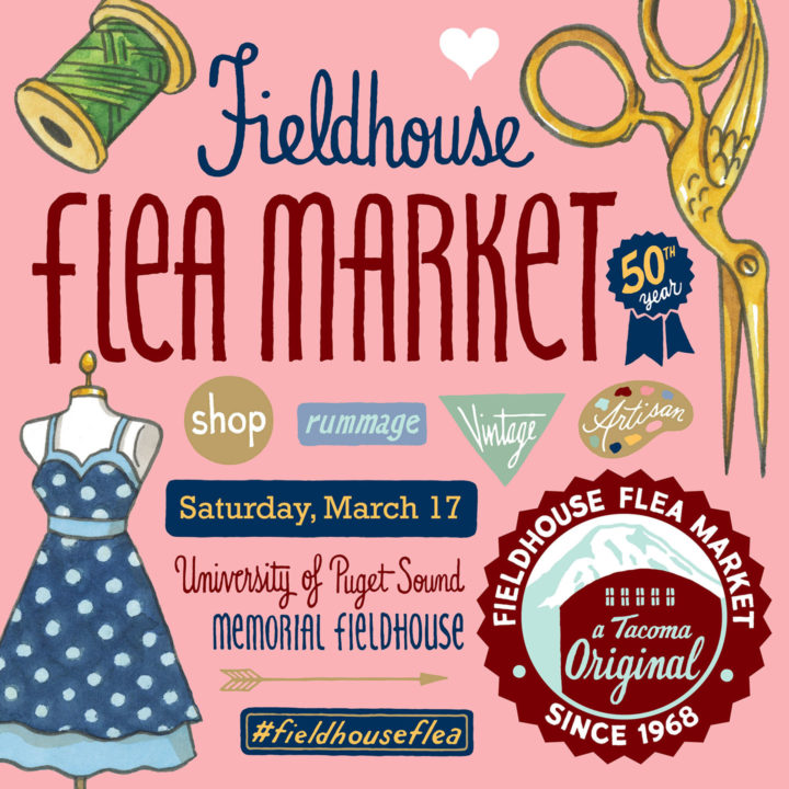
This Saturday is the 50th annual UPS Flea Market, hosted by the Puget Sound Women’s League. The event raises money for student scholarships (that’s what the ticket price supports, in case you’re wondering), and features everything from one-of-a-kind art to handmade crafts to rummage-sale-style bargains. There will also be gently-used books for sale, as well as an array of homemade baked goods (in honor of the first Flea Market’s Parisian theme, they’re bringing back French tarts this year!).
I had the honor of designing/illustrating/lettering their poster, logo, social media campaign and other elements this year—it was one of the most fun projects I’ve had in some time (who doesn’t love drawing upside-down garden gnomes?). I’ll also have my usual booth there on Saturday: you’ll find me, Jessica Spring and Maria Jost (plus lots of Dead Feminists goodies) all in one big double booth, #5/6 on the main floor.
Here’s the scoop:
50th Annual UPS Flea Market
This Saturday, March 17, 2018
9 am to 4 pm, entry fee $5
(8 am early-bird entry fee: $10)
University of Puget Sound Memorial Fieldhouse
N. 11th St. between Alder and Union, Tacoma, WA